Topic
For my AP Thesis I have developed an app concept for my client BoligPortal in order to increase the users experience for home-seekers and landlords.
Timeframe
March – June 2020
Keywords
Case Study, Design Thinking, AP Thesis, UX/UI Design
Introduction
BoligPortal. Denmark’s largest housing portal with over 15.000 properties available online and thousands of seekers looking for a new home every day. One is able to find a property very fast based on his wishes, meet the landlord, sign a contract, and move-in.
However, finding a new house to live in is not the only feature BoligPortal has. Even though it might be the most important one for home seekers. In such a complex platform, home seekers go through a long flow with many options and features before they get their new housing. From onboarding, creating profiles, looking through hundreds of property profiles, creating PropertyAgents to contacting a particular landlord, and signing a contract online.
But where do all the properties on BoligPortal come from? Well, they come from landlords. Landlords that create the same profile as home seekers, but with a purpose to sell something. Not to find something. Their main goal is to rent out their property. But to achieve this, there’s a longer, more complicated flow awaiting them.
They start by creating a stunning profile for their property. After they publish it, they can follow statistics to see how many views their property gets. They can answer messages using BoligPortal’s online messaging system. They can contact possible tenants using the “Find Tenant” feature. And later, they can create contracts for new tenants by themselves simply by filling in an online form also using BoligPortal.
Both audiences – home seekers and landlords – seem to have almost everything in BoligPortal. Everything that makes it easier to find/rent out a property. But I wouldn’t be doing this project for BoligPortal if there wasn’t a way that would make it even easier for both parties…
Problem description
Nowadays, we live in a world where smartphones are the most used devices and where good business is often judged by the company’s representation in online media which in BoligPortal’s case would be rated as outstanding.
However, the weak point for the company might be their poor presence on the Mobile Applications Market. The app currently available hasn’t been updated for over a year now which makes it hard for users that prefer mobile apps over responsive web design.
It is very debatable if a poor app is better than none. Bad reviews can often influence others from using the product which can lead to customer loss.
So what is better? To stand out from competitors with a poor app or to stand in line with competitors without a poor app but a great responsive web platform?
Or is there any other choice?
Problem statement
How can I further improve BoligPortal’s mobile platform in order to strengthen their market position from the competitors and increase the user experience for the users?
- What is the current state of the Danish market in regards to housing?
- What are our users’ wishes and needs when it comes to using BoligPortal on mobile devices?
- How can I bring more value to users that are using BoligPortal on their mobile devices mainly? What can differentiate us on mobile devices from the rest of the competitors?
- How can I scale down such a complex platform but still make it understandable and easy-to-use for users, and let them achieve their goals without any struggles?
Methodology
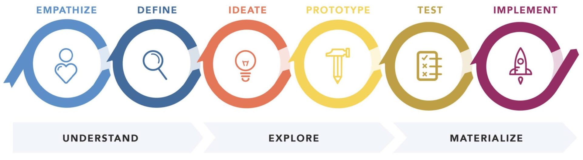
The solution was developed following the six stages of the Design Thinking Process by Nielsen Norman Group.
In the first step, BoligPortal’s products, target audience, business, and competitors were analyzed, strategy for this project defined and personas created. In the define stage, finding from the empathize stage were summarised into a creative brief and challenges using the How might we…? technique were defined.
During ideate and prototype stage, the actual solution was built from scratch and later tested in the fifth stage and coded in the last stage.
Project management
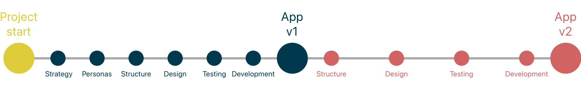
The project was split into two parts – App version 1 and version 2 as shown in a simple roadmap below. The first version was developed within the timeframe given for the project (2 months) and included all features for home-seekers.
The second version was later developed for the exam presentation (Approximately a month after handing in the thesis) like future improvement and included the majority of tools for landlords.
Empathize
The Empathize stage was split into two parts – BoligPortal’s business where its products and competitors were analyzed and BoligPortal’s target audience where its users were observed and interviewed.
BoligPortal
The first step of the company’s analysis was an interview with its Product Manager and UX Designer Frederik Romming whose purpose was to introduce me to the company, its products, and customer segments.
Take-aways:
- BoligPortal has two products – one in Denmark (BoligPortal) and one in Sweden (BostadsPortal), however, the company is based in Aarhus, Denmark only
- In Denmark the product is available in web version and mobile app version
- In Sweden there’s only web version of the product
- Two main customer segments are home seekers and landlords
- 88,8% are home seekers and the rest are landlords (furthermore divided into private and pro landlords)
Other data provided:
- Quantitative data used further in the process
- Design guidelines used further in the process
Analysis of the current product
As mentioned before, BoligPortal has a few products – web platforms for Denmark and Sweden and a mobile app for Android and iOS in Denmark. The goal of this analysis was to understand all features the platform is providing users with.
Web platform
| Features available for home-seekers | Description |
|---|---|
|
Search properties
|
Searching properties based on the filters (Location,
price, size, rooms, additions) |
|
BoligAgent |
Every time there’s a new property matching
user’s preferences (filters) added, he receives
an email informing him about the property |
|
Preview properties (Property Profile) |
Detailed information about property can be
found here – price, location, pictures, description. |
|
Contact landlords
|
A feature that requires a premium account, but then allows users to unlimitedly communicate with landlords. |
|
Favourite properties |
Users have an opportunity to mark properties with a star and find them in their “Favourite” list anytime later. |
|
Profile |
Users should present themselves in a good way so they give landlords first good impression. |
|
Notifications |
Users can filter email notifications – Newsletter,
Weekly Digest and choose language of the
emails. |
| Features available for landlords | Description |
|---|---|
|
List a property |
Landlords can list their property simply by filling
in a form (basic information about the property,
pictures and everything that will later appear on
the property profile for users) |
|
Promote a property |
There are three subscriptions available for landlords
that can highlight their property ads in the
search. |
|
Statistics |
For each of the properties, there’s a separate
statistics page so landlords can see how many
views their ad got each day. |
|
Communicate with home-seekers |
Landlords can communicate with tenants either
by BP’s online messaging system, phone or
emails. |
|
Find Tenant |
Landlords can search for tenants based on their
preferences using the “Find Tenant” feature. |
|
Create contracts |
Once a landlord finds a new tenant, he can
(doesn’t have to) create a contract using an
online contract system on BoligPortal. |
|
Customer support |
Landlords have access to customer support
every single day 9-21. They can either search
a customer support page where they question
might be answered or they can call the customer
support team. |
Mobile App - Google Play
As mentioned before, BoligPortal has a few products – web platforms for Denmark and Sweden and a mobile app for Android and iOS in Denmark. The goal of this analysis was to understand all features the platform is providing users with.
Mobile App - App Store
The average rating happens to be a little bit better on the App Store where it’s 4.2 stars. However, only 89 rated it while on Google Play, the app has over 1.5 thousands ratings.
Web vs. App
| Feature | Web platform | Mobile App |
|---|---|---|
|
Search properties
|
✅ |
✅ |
|
BoligAgent |
✅ |
✅ |
|
Preview properties
|
✅ |
✅ |
|
Contact landlords |
✅ |
✅ |
|
Favourite properties
|
✅ |
✅ |
|
Profile
|
✅ |
✅ |
|
Notifications |
✅ |
✅ |
|
List a property
|
✅ |
✅ |
|
Highlight a property
|
✅ |
❌ |
|
Statistics
|
✅ |
❌ |
|
Communicate with landlords
|
✅ |
✅ |
|
FindTenant
|
✅ |
❌ |
|
Create contracts |
✅ |
❌ |
|
Customer support |
✅ |
✅ |
The mobile app is simple with not so many features compared to the Web Platform. It has the most used and necessary features and it’s more oriented on the home seekers rather than landlords. Home seekers would be able to find their new home through the app, but landlords wouldn’t be able to showcase and rent out their property in the best way through the app.
The only disadvantage seems to be the functionality of the app. Due to many bad reviews and ratings, I also decided to skip the usability testing of this app as I could get enough information about the app just from reading those reviews.
Competitors
As mentioned in the introduction, BoligPortal is Denmark’s largest housing portal used by thousands of people. However, it is not the only housing portal in Denmark. Therefore, it was necessary to conduct this analysis to identify industry trends and adapt to competitor campaigns or strategies in order to maintain the position in the market or out-compete the competitors entirely.
Based on the competitors’ analysis, all of the companies have some advantages and disadvantages. All of them provide users with a free search of the properties but when it comes to contacting landlords, they need to pay around 300kr per month. Landlords have the opportunity of listing their property for free as well, however, if they want their ad to appear in the top searches, they need to pay for advertisement.
Compared to BoligPortal, none of the competitors is reaching the amount of available properties and none of them is providing customer support as BoligPortal does (9-21 everyday). Furthermore, all the competitors except one take foreigners into consideration as Denmark is full of them (pg.25) and having an english translation of a website is a big plus.
Features available to users and landlords seem to be very similar based on this overview. How- ever, “seem” is not enough, therefore an in- depth analysis of the features of each housing platform was conducted in the next step.
Competitive benchmarking
An in-depth analysis of BoligPortal’s competitors gave me a great insight into what others are providing their customers with. This analysis made it easy to spot the gaps between the companies and in further steps of the process, this analysis was taken into consideration later when creating concepts and content for the new product to make sure that I provide users with all the features they need and I don’t stay a step behind the competitors.
| Feature | BoligPortal | Lejebolig | BoligDK | BoligSurf | FindBoliger |
|---|---|---|---|---|---|
|
Search properties
|
✅ |
✅ |
✅ |
✅ |
✅ |
|
BoligAgent |
✅ |
✅ |
✅ |
❌ |
✅ |
|
Preview properties
|
✅ |
✅ |
✅ |
✅ |
✅ |
|
Contact landlords |
✅ |
✅ |
✅ |
✅ |
✅ |
|
Favourite properties
|
✅ |
✅ |
✅ |
✅ |
❌ |
|
Profile
|
✅ |
✅ |
✅ |
✅ |
✅ |
|
Notifications |
✅ |
✅ |
❌ |
❌ |
|
|
List a property
|
✅ |
✅ |
✅ |
✅ |
✅ |
|
Highlight a property
|
✅ |
✅ |
|||
|
Statistics
|
✅ |
|
|
|
❌ |
|
Inbox |
✅ |
✅ |
✅ |
✅ |
|
|
FindTenant
|
✅ |
✅ |
❌ |
✅ |
❌ |
|
Create contracts |
✅ |
|
✅ |
||
|
Customer support |
✅ |
❌ |
✅ |
✅ |
✅ |
|
English translations |
✅ |
✅ |
✅ |
✅ |
❌ |
|
Mobile App
|
✅ |
❌ |
❌ |
❌ |
❌ |
Strategy
Consider all data collected, the most reasonable strategy for BoligPortal should be to not let competitors overcome them by introducing a proper mobile app connected to the Web Platform that will make searching for properties easier. This would only improve its customer-centric approach and strengthen its position on the market.
Knowing the best strategy for BoligPortal, it was time to move on and discover what has the target audience to say about this new strategy. Is a new app going to make their searching easier?
BoligPortal's customers
Targeting the right audience means better results in the activities a company does. Therefore, in this step, the target audience, a group of potential customers to whom BoligPortal addresses their product, was defined.
In order to achieve the goal, I decided to follow “HOW MIGHT WE…develop a persona?”, a 10 – step process, from The Design Thinking Playbook. However, for this particular case I found it useful only in the first 5 stages. Further stages are not related to my case, because they demand a whole team to review them and work with them or update the personas after months of development.
#1 Find the users
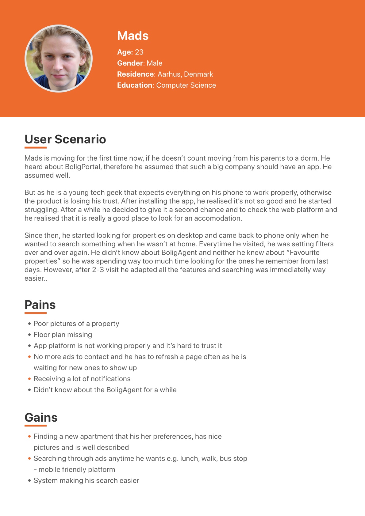
During the kick-off meeting I have figured out that BoligPortal’s customers are divided into two big segments – home seekers and landlords. Home seekers share one common goal – to find a new place to live. And all the landlords share a common goal as well – to provide the home seekers with a new place to live.
AEIOU method
| Home seekers | |
|---|---|
|
Activities |
– People are looking for apartments online and observing apartments in real life after successfully contacting landlords |
|
Environment |
Properties, Online Housing Platform, Social Media Users use BoligPortal anywhere and anytime when they want as it’s easily accessible on their smartphones |
|
Interaction |
– Landlords and home seekers interact together on an online platform in order to achieve their primary goals – Interaction between these two audiences is happening when a home seeker decides to contact a landlord. Then they interact with each other through an online messaging system, phone or email – Home seekers have the ability to search property ads as much as they want, preview photos, plans or locations – Contacting landlord is a part of a Premium Profile and after contacting a landlord for the first time, the communication continues via messages, phone or email – BoligAgent serves seekers in case they don’t have time to check the platform every day for a new apartment. They can set up the Agent with their requirements for and they will receive an email every time a new property matching their requirements is added – Home seekers can adjust their profiles in order to give the first impression to a landlord in case he has some preferences |
|
Objects |
– Smartphones for searching properties anywhere and anytime – Desktops for more serious search, purchases, and communication with landlords |
|
Users |
Home seekers |
| Landlords | |
|---|---|
|
Activities |
– Renting out apartments – Posting their property ads on different housing portals, social media, sharing with friends, colleagues – Providing home seekers with more details about the apartment – Communicating with potential tenants – Taking care of the apartment – Providing home seekers with apartment tours (scheduled tours or open house) – Doing administration about the apartment |
|
Environment
|
Properties, Online Housing Platform, Social Media |
|
Interaction |
– Landlords and home seekers interact together on an online platform in order to achieve their primary goals – Interaction between these two audiences is happening when a home seeker decides to contact a landlord. Then they interact with each other through an online messaging system, phone or email – Regarding property ad, landlords need to list it in the beginning, then follow statistics to make sure people are viewing their ad and buy a subscription in case they want to reach bigger audience – Landlords can manage their ads anytime they want – they can change description, add/delete pictures or delete an ad completely |
|
Objects |
Properties and a laptop for managing their property ads |
|
Users |
Landlords |
#2 Building up a hypothesis
My approach in this step was to describe the target audience based on my knowledge I’ve gained so far during client analysis and the AEIOU method. Furthermore, to get more data during this step I conducted desk research about moving, age groups, the population in Denmark, and smart device usage.
| Hypotheses | |
|---|---|
|
Young people tend to move more often |
Young people ( 20-35 years old) are moving out more often than older people. On average once in 2 years. |
|
Most of the users are danes, but don’t forget about many foreigners living in Den- mark |
The majority of the home-seekers are Danes as the company is for the Danish market. However, there will also be quite a big amount of foreign users as Denmark has around 15% foreigners living here.
Furthermore, considering statistics from DST
– Statistics Denmark, there is a high number of international students as well which increases the number of foreigners in Denmark. |
|
Mobile devices for basic use |
In general, the number of people using their smartphones for Internet search is increasing since 2009, while the number of people using their desktop for Internet search is decreasing rapidly since 2009. |
|
Large devices for important actions |
However, based on a study from Nielsen Nor- man Group, people prefer desktop for important actions as mobile devices still limit the UX for complex tasks and therefore users feel safer on the desktop when taking serious actions e.g. buying a subscription, creating contracts, listing properties. |
#3 Confirmations
In order to confirm my hypotheses, I needed to collect and evaluate the real data. Therefore, I started with checking Google Analytics as it could provide me with the right data about demographics. Later, I conducted a couple of in-person interviews with people that were moving recently and talked with them about the journey. Furthermore, I conducted an online survey to gain more quantitative but also qualitative data.
Google analytics
The data provided from Google Analytics confirm the hypothesis that the majority of the users are young people from Denmark. 60% are women and 16% of foreign users confirm the statistic from DST and the article from The Local.
User interviews
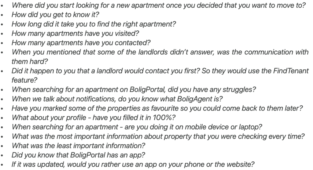
After I got data about demographics I was able to choose the right people for in-person interviews. Five Interviewed people were in the age group up to 35 years, while three of them were girls and two of them were danish in order to keep the conversion rate from Google Analytics. All of the interviewees experienced moving in the past few months and were able to describe their journey from decision-making, through searching for the apartment to move.
My goal was to find out how the experience was, especially how was their experience when using housing portals. The questions and summary of findings are below.
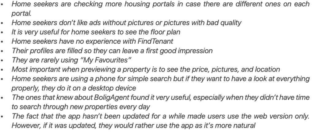
Online survey
In order to continue collecting data about home seekers, an online survey in Google Forms was created. It was created for the purpose of gathering mainly quantitative data and the questions were related to the findings from the in-person interviews in order to gain more data to the particular findings. The only survey was filled in by 12 people
| Online survey findings | |
|---|---|
|
What is the most important information you check on a Property Ad? |
Pictures (12), Rent (11), Takeover Date (7) |
|
How long have you been looking for your
new home? |
1 month (7), 1-3 months (5) |
|
Did it happen to you that there were no properties
that you liked? |
Yes (7), No (5) |
|
Have you ever used BoligAgent? |
Yes (6), No (6) |
|
Did you find BoligAgent useful or not useful?
Tell us why. |
I didn’t have to search by myself but getting
many notifications got annoying at
some point |
|
Have you used “Properties I am interested
in” function in order to easily access properties
you marked or contacted? |
Yes (4), No (8) |
|
Have you filled in your profile carefully? |
Yes (7), No (5) |
|
Have you ever tried the BoligPortal App for
mobile devices? |
Yes (2), No (10) |
#4 Finding patterns
During the kick-off interview I got to know two main segments – home seekers and landlords. Furthermore, landlords are divided into three smaller groups based on the amount of properties they own.
After previous research, I decided to also divide home seekers into two smaller groups – newcomers and returning users. Newcomers are using BoligPortal for the first time and returning users are customers that are coming back to BoligPortal every time they are moving.
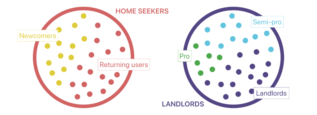
Furthermore, I decided that the primary audience will be the home seekers while landlords belong to the secondary audience for this solution. This is also supported by the fact from the kick-off interview that 88,8% of the customers are home seekers and by the fact that landlords tend to use larger screens as I found out during desk research.
#5 Personas
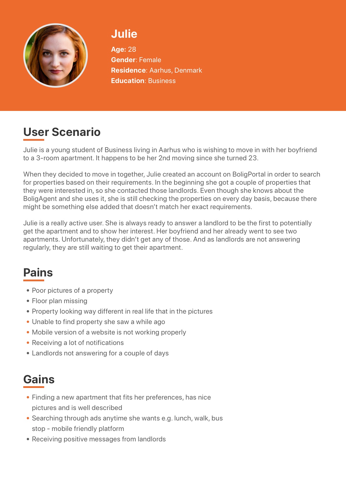
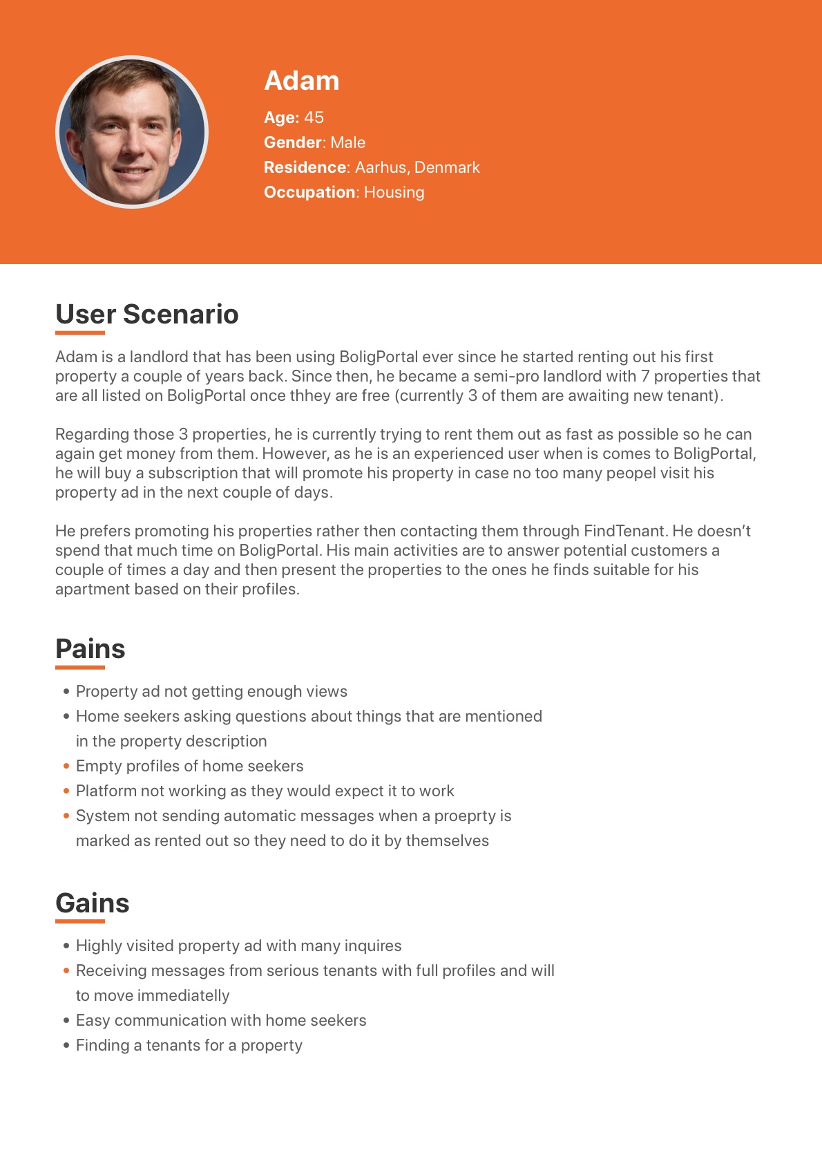
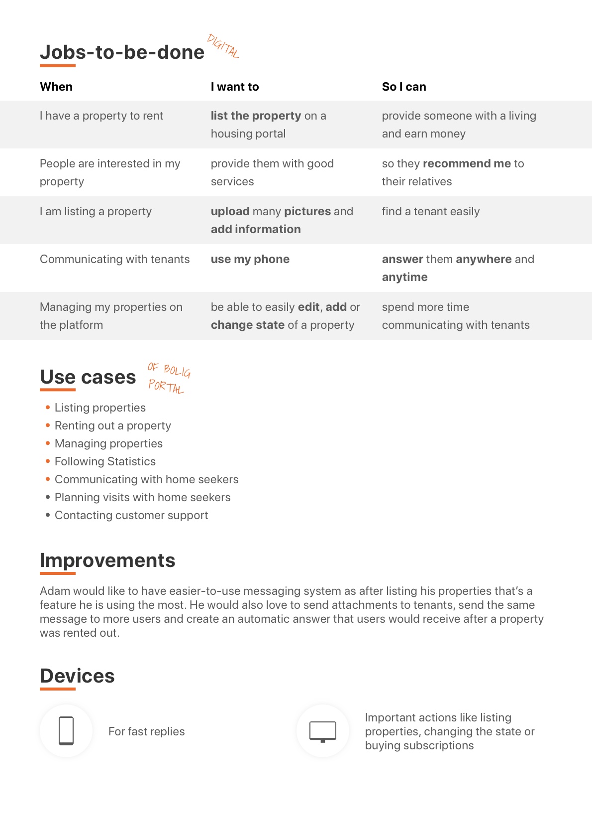
The primary target audience is represented by Julie that is currently looking for her new home and by a newcomer Mads. The secondary audience is represented by a semi-pro landlord Adam owning seven properties.
Hover to see the back side of personas
Define
In the Define phase was about combining research insights and defining where problems exist and how to solve them in the next phase of the project.
In the Client Analysis, the conclusion was that the best strategy for BoligPortal could be a brand new app for mobile devices. Not only because they have an old one that hasn’t been updated for a year, but also considering the market state. Based on the competitors’ analysis, none of the direct competitors has an app. Therefore, a new app could strengthen BoligPortal’s top position in the market.
In the User Analysis, my goal was to find out what does the target audience has to say about BoligPortal and how much are they familiar with using it on mobile devices. The first step in the User Analysis was to observe users and later come up with hypotheses based on observations and desk research. As I found out while coming up with a hypothesis, the number of people using mobile devices to search the Internet has been rising ever since 2009. Furthermore, data from Google Analytics showed that customers of BoligPortal are using their platform mainly on mobile devices (68%). And last, but not least, around 50% of customers are young people up to 35 years old who use smartphones on an everyday basis and desktop devices are almost forgotten by them.
All of the facts mentioned above supported the idea of a new app. However, it was just a hypothesis. Therefore, interviews with real home seekers and online surveys filled in by home seekers were necessary to conduct in order to confirm the hypothesis. During the interviews, I got to know how home seekers use BoligPortal, what are the most-used features and what are their goals, pains, and gains. Furthermore, the survey provided me with quantitative data that 33% of people that answered the survey didn’t know that there is an app and another 33% knew that there is an app, but they didn’t like the functionality, so they decided to use the web platform instead.
Unfortunately, landlords had different opinions. And their opinion was also supported by NNGroup’s research mentioned in the User Analysis which says that users tend to use larger devices for important actions. Meaning – landlords rather use their desktop device to list and manage their properties as those are considered to be very important actions for them.
In conclusion, the strategy from the Client Analysis “got approved” by my users and therefore, my goal throughout the new phases of the Design Thinking Process will be to develop an app based on the user’s needs. The main target audience will be home seekers, however, as landlords create big revenue for BoligPortal, it wouldn’t be smart to exclude their universe from the app.
Creative Brief
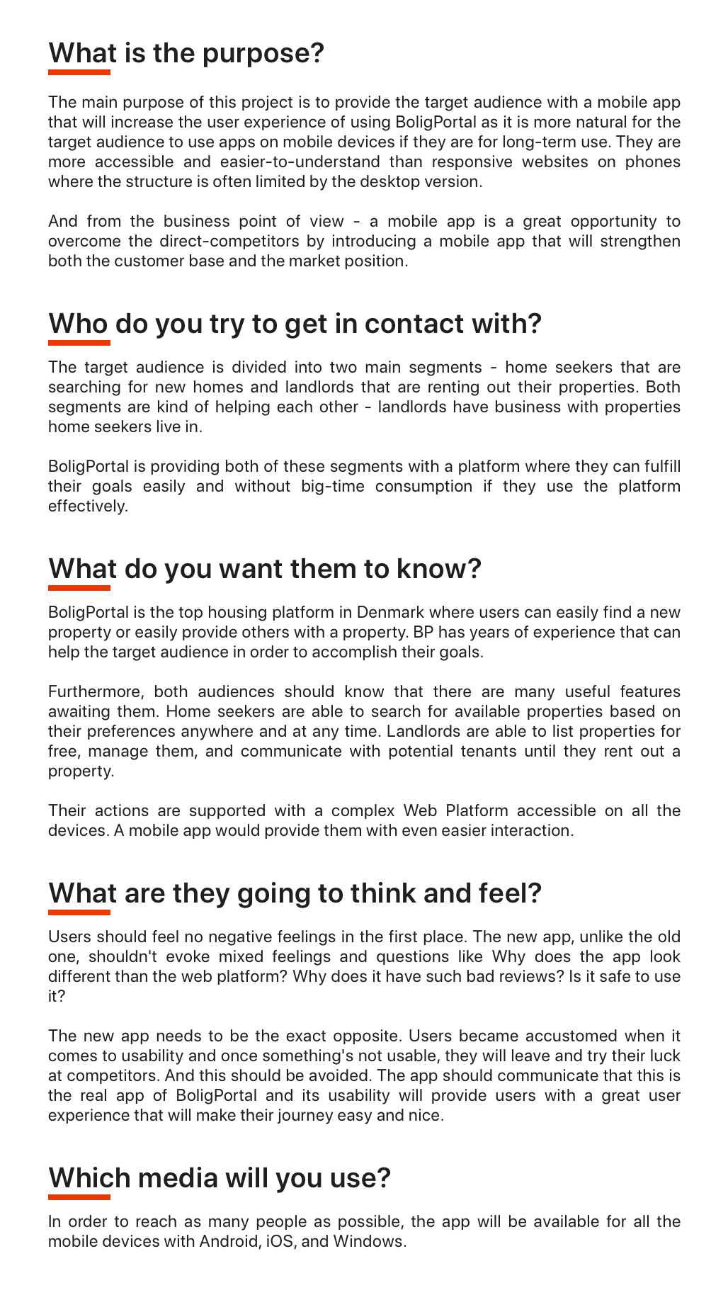
How might we...?
In order to understand the overall problem in a more detailed way, I decided to conduct an exercise from Google Ventures Design SPRINT. The goal of this exercise was to look at the problems from a more positive point of view by transforming them into opportunities. I was using sticky notes to write down everything – one sticky note for each opportunity where each question was starting with How might we….? For example – How might we make the app useful for landlords?
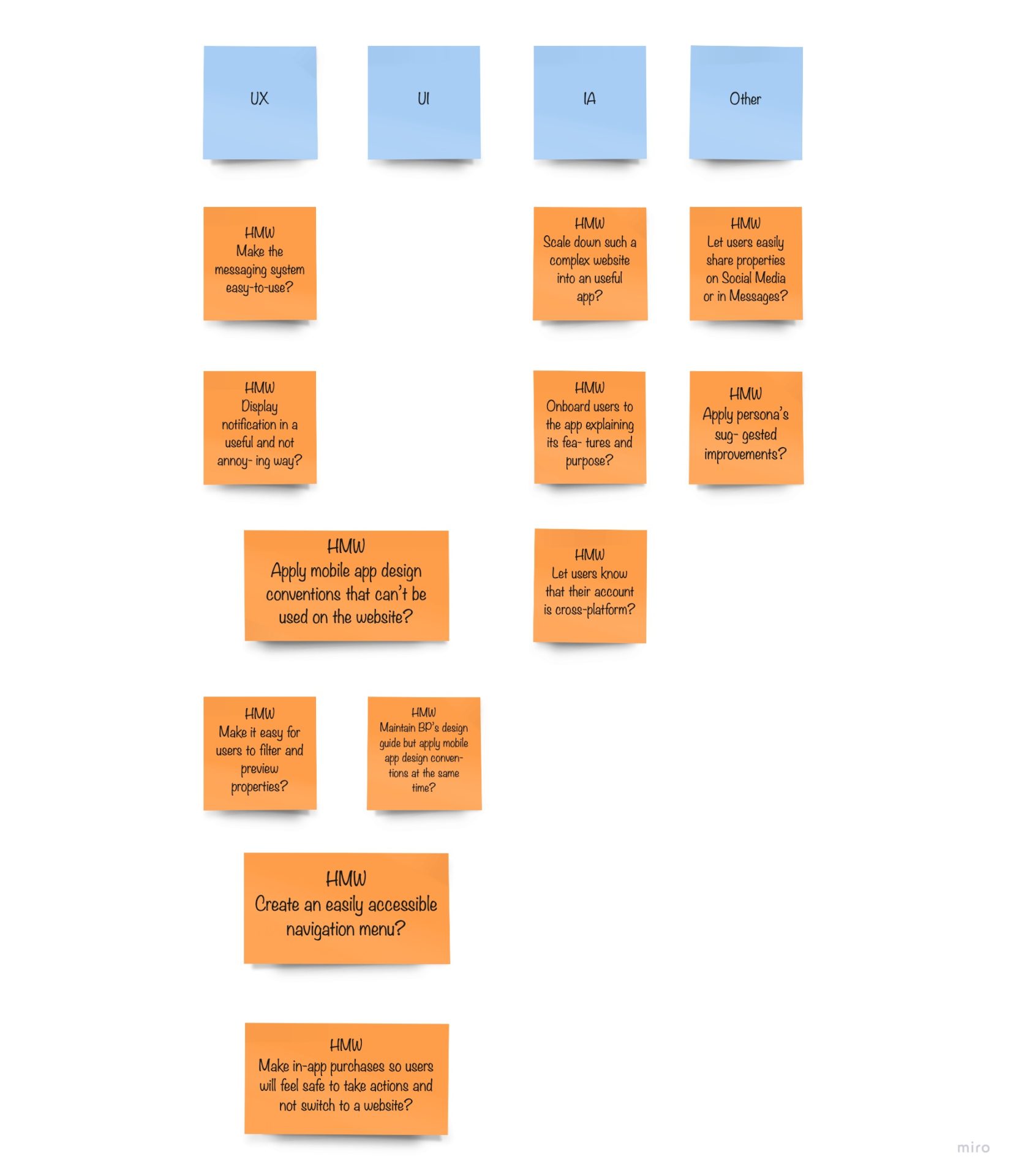
This, very useful, exercise helped me to understand problems from a different point of view and later in the process, when brainstorming, creating the concept, or designing, I often looked into the table to remind myself about the problems I was solving. Furthermore, splitting these questions into groups helped me to recognize at what stage of the process to use them – In the next phase I was about to answer questions to IA, and later I was answering those to UX and UI.
Ideate
Brainstorming
At the beginning of the concept building, brainstorming helped me to continue working with the HMW questions from the previous chapter. During this exercise, I wanted to write down as many ideas about the new product as possible and at least half of my new ideas were answers to the HMW questions.
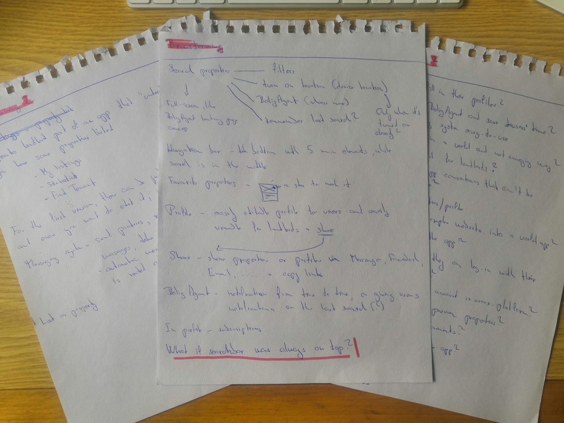
Three rounds of 5-minutes long brainstorming sessions made me think out of the box so I wasn’t allowed to go with the first ideas I got right in the beginning.
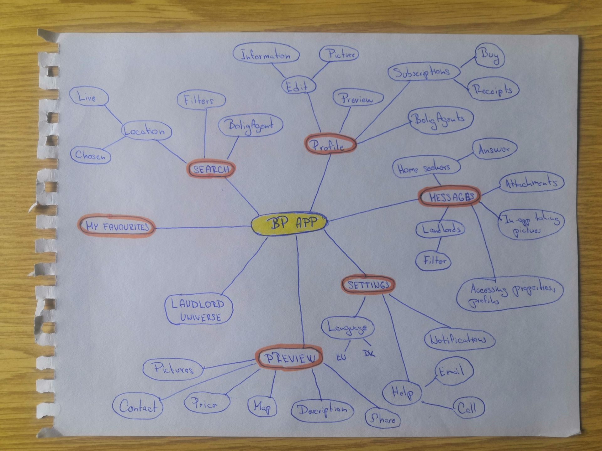
Mindmap
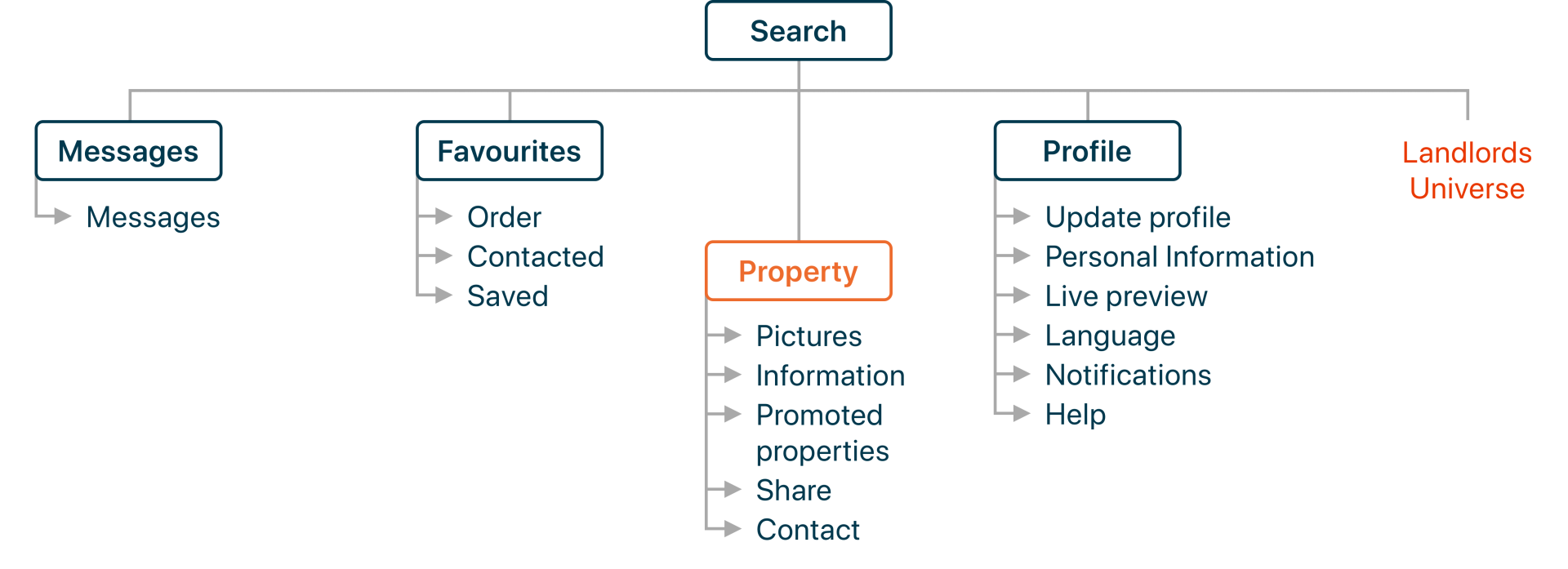
Brainstorming is always about writing down as many ideas as you can without any structure. Mind Map is a diagram used to visually organise the ideas. My mind map is divided into six big groups where each of them has a few related subgroups or elements. The big groups are the most used and visited features – Search, Messaging System, Property Preview but also the whole “Landlord universe” that is not going to be developed in the v1 of the product but I kept it there to see the whole structure for the future.
Sitemap
To create a sitemap of the future product I conducted a testing – closed card sorting on future users. In this exercise, participants were asked to group cards. Each card included a piece of content or feature and those cards were to be sorted in 6 groups – Search, Messages, My favourites, Profile, Setting.
The conclusion of this testing was clear after just a few participants as all of them create more or less the exact same groups and therefore I could create the final structure.
Sketches
Once the structure was created, I went further in the process and by following the Crazy 8 method from Google Ventures Design SPRINT I created sketches. This method helped me to generate a lot of ideas very fast. To make it clearer later, final sketches were redrawn and comments were added.
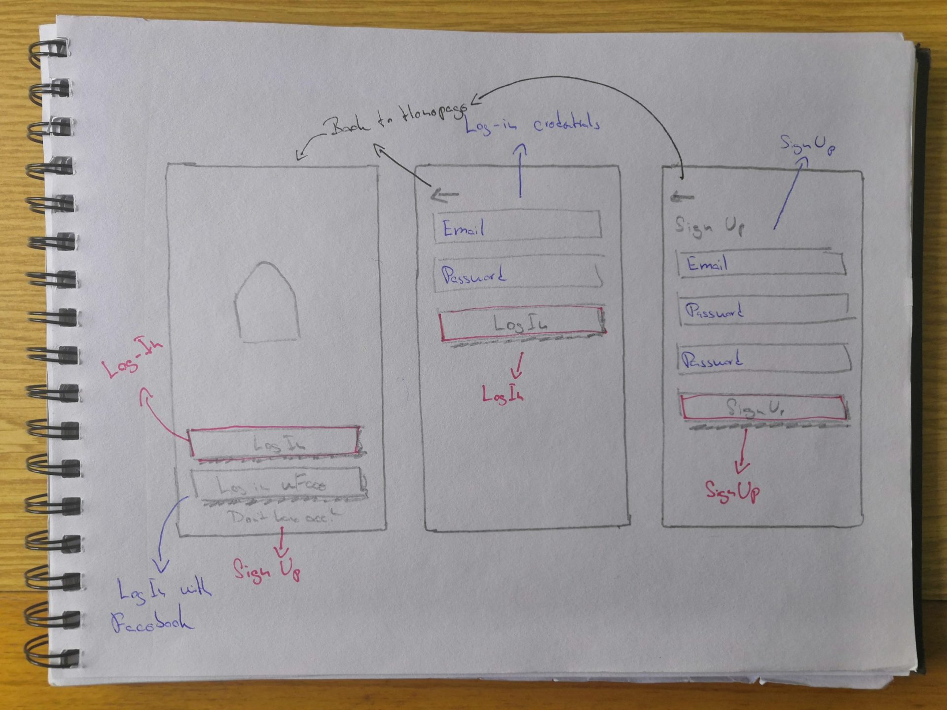
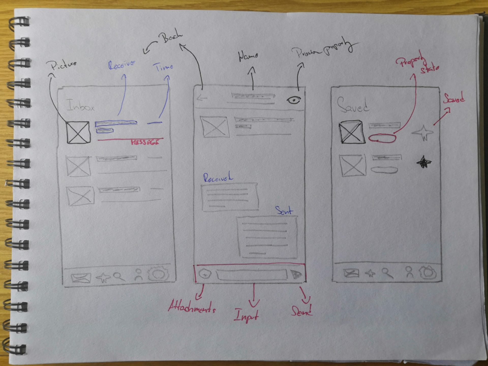
Wireframes
In the beginning, wireframes were created to communicate the structure of the new app. Each page contains real content and elements where all the pages together create a low-fi prototype communicating the structure and functionality.
However, for me, the wireframes weren’t just communicating the structure of the new app. They were a starting point towards creating an accessible and functional app. In the prototype, you can try and see the whole “core” of the app. However, it wouldn’t be such a great experience for a user to just open an app and start using it, would it?
Therefore, when creating a structure, I didn’t create the “core” only. I also thought about aspects that can increase the usability of an app – starting with Onboarding, Empty States, Microcopy and finishing with User Flows.
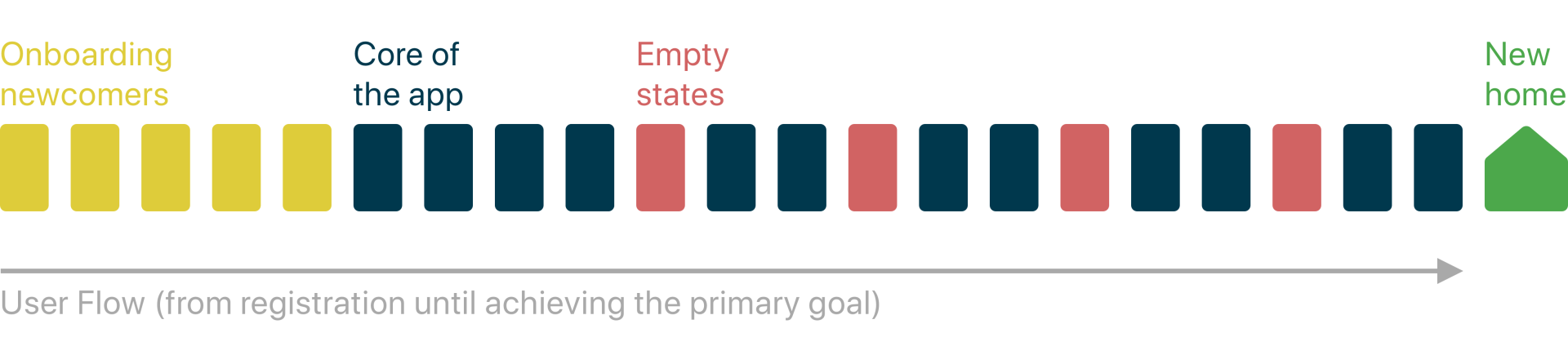
Onboarding newcomers
A very crucial step is the first one – when users are opening the app for the first time. Therefore, it’s necessary to introduce the app and its functionalities in a couple of steps that help users to get into the product’s experience. “The user onboarding can be simple as a greeting and an explanation or as complex as a series of guided tasks for users to complete.” (Chapin, 2018)
Compared to the quote above, onboarding in this new app would be as simple as a greeting. New users go through a series of steps after creating an account that will help them to fill-in their profile which is a crucial aspect for landlords and then they will be introduced to search. At the end of the onboarding, newcomers are also introduced to the BoligAgent so they know about it from the beginning and don’t struggle with it like Mads.

Empty states and microcopy
As an onboarding explaining all the features would be really complex and users might be struggling to understand some features without seeing them in the first place, I decided to create a short separate “mini-onboarding” for each feature. This mini-onboarding can be called as an Empty state that occurs when content on a page can’t be shown for some reason.
In this app, there are two kinds of empty states. Let’s take the Inbox for example. The First Empty state is when a user has no messages in his Inbox and the second one is when the Inbox can’t be loaded because of poor Internet connection or server problems.
This is also a moment when the Microcopy does its job. This tiny piece of information is used for explaining what’s going on on the screen e.g. in all empty states, onboarding or error messages.
Thanks to these small aspects, the solution got even more complex and easier to use for users as they can now easily identify and recover from errors or take further actions based on the hints on the screen. Once the last pieces of the wireframes were done, it was time to connect all the screen to user flows for Mads and Julie.
User flow - Julie
When Julie logs into the new app for the first time, she already knows the features. She knows the web platform very well. Her BoligAgent is constantly turned on, therefore after logging in she sees only properties matching her preferences on the Search Result Page.
In the beginning of her sessions she checks her inbox for new messages and then she fastly goes through new properties, previews them, contact some of them.
Later she comes back when she receives a notification or when she feels like searching
again.
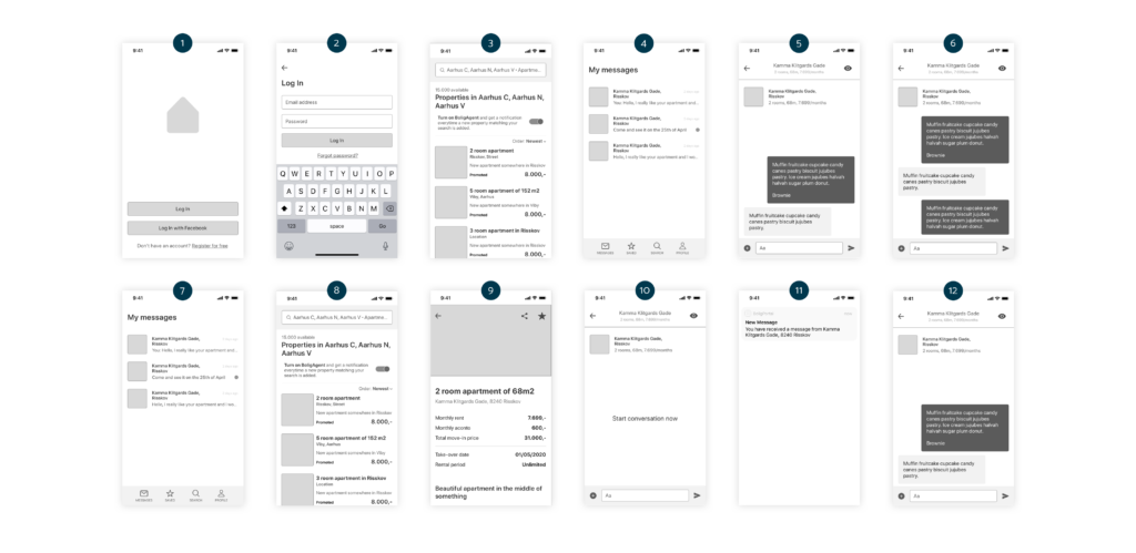
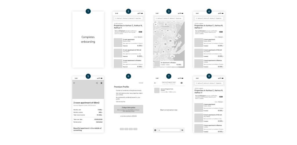
User flow - Mads
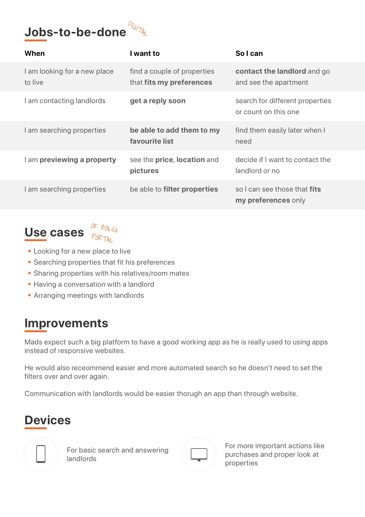
Once Mads uses the app for the second time (after first failed attempt), he starts with typical onboarding for newcomers.
Later he is searching for properties in Aarhus in both map and list view. When he thinks he likes a property he goes to read more about it on the Detail Page and contacts the landlords. However, as he is a new user, he needs to buy a Premium Profile before he can contact the landlord. When finishing his session, he checks if the BoligAgent is active so he can receive notifications whenever a new property is added.
Next time he opens the app, he is considered as a returning user that goes in Julie’s flow.
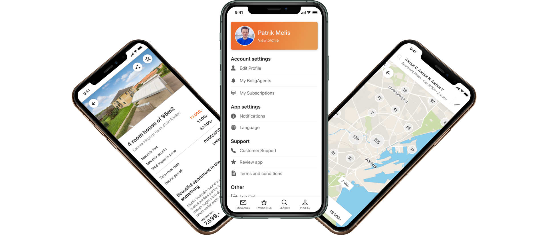
Prototype
Once wireframes – the skeleton of the whole solution was done, it was time to for applying interface elements from the design guide to create mockups and hi-fi prototype later.
You can try the prototype on Sketch Cloud. I didn’t manage to iFrame it here 🙁
Test
Another very important step towards creating a usable product was to test the prototype of it on customers in order to identify any issues. This phase was divided into two parts – in the first one I evaluated the prototype using 10 Usability Heuristics by Jakob Nielsen and then I moved to test on real users.
Heuristic evaluation
Usability Testing
However, me testing the prototype and users testing it are two very different things. Usability testing on users was necessary to identify errors and problems regarding usability, structure, and design.
Overall, I prepared 23 tasks for users and each testing was planned for around 15-20 minutes. I decided to test 5 users as based on a study by Jakob Nielsen, only 5 users can identify 80% of all the issues and I would waste my time testing more.
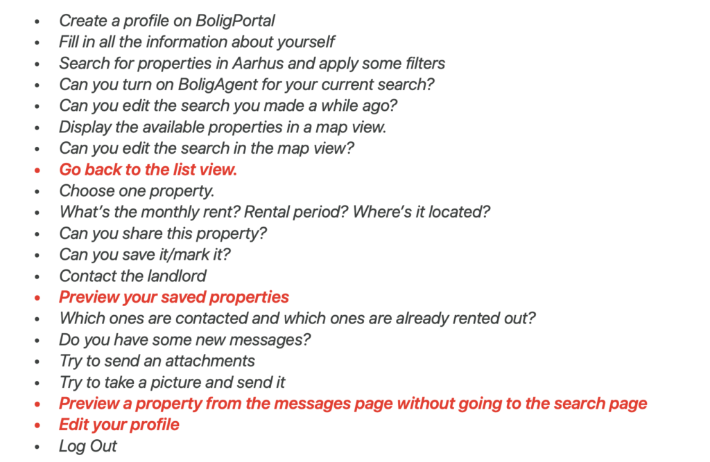
Besides observing users when fulfilling my tasks during the testing, I also led a conversation with them at the end of the testing about the struggles they had during the testing to understand it more and decide whether it’s necessary to solve the particular issue or the reason for their failure was different than a usability problem.
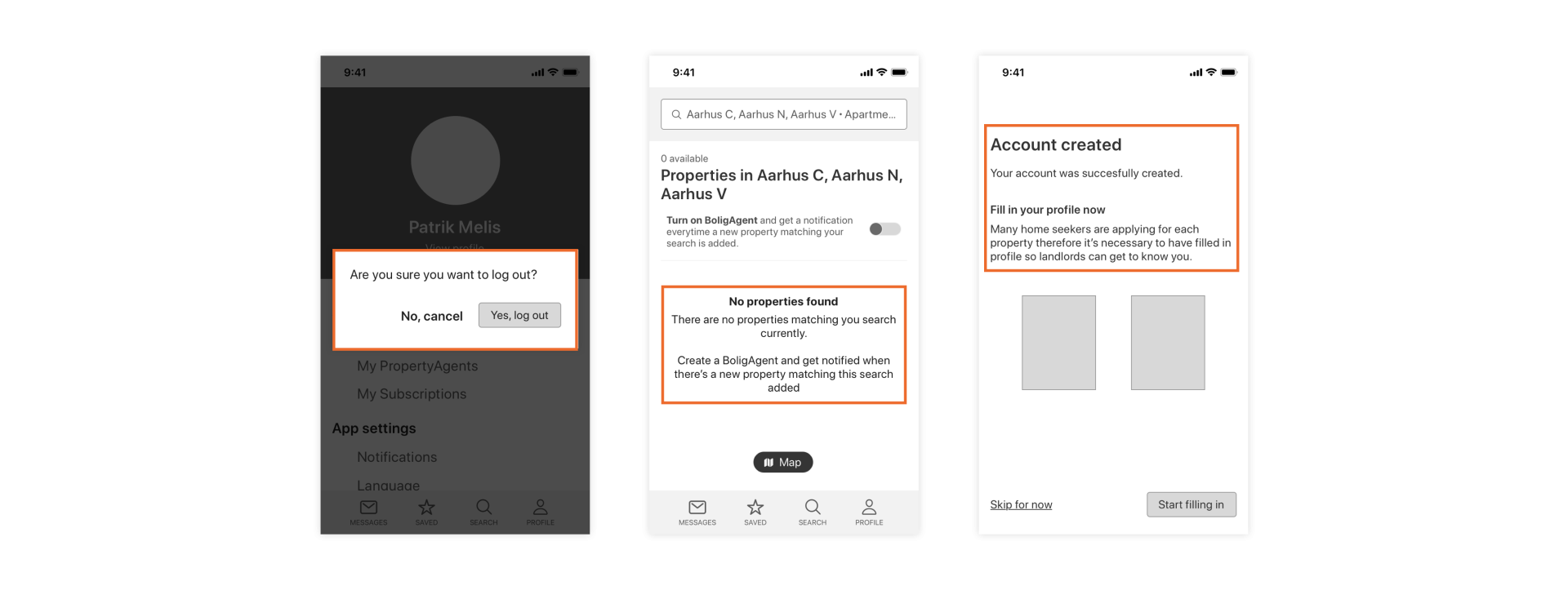
The highlighted tasks in the table above show the tasks users were struggling with or had to say something about them and therefore I decided to make some changes.
- The back button stayed in the same place, however, the design of it was changed as previously it was almost the same as circles on the map so it was hard to spot it.
- Saved properties were renamed to My Favourites as it sounds more personal and the star icon is more for favorites than saved as users mentioned
- When it comes to the Eye icon in the messages, the whole header was changed to clickable and the icon will be just an indicator
- “Update profile” was renamed to “Edit profile” as users found it a bit confusing
Two different testing methods helped me to identify and solve problems regarding design, content, and usability very easily and therefore I marked this phase as done and was ready to move to the last phase where the actual App was built.
Implement
HTML, CSS, Javascript – coming soon
Conclusion
The main goal of this project was to improve BoligPortal’s mobile platform in order to strengthen market position from competitors and increase the experience for users. In order to achieve this goal, I went through six phases of the Design Thinking process where each phase gave me a lot of knowledge that I used in the next phase.
In the beginning, after BoligPortal was analyzed into details, I compared the company to its competitors in order to be able to create and select the right strategy for business by the end of the chapter which turned out to be a new Mobile App. The main facts that supported the strategy considering the analysis were that BoligPortal has an old app with really bad reviews and that none of the direct competitors in the market has an app. They all are one-platform products and therefore, BoligPortal could take advantage of this and overcome competitors.
The user analysis showed that users use their mobile devices when it comes to BoligPortal and their primary goal is to find a new place to live in a short period of time, preferably within 1 month. They search for properties anytime they can and therefore their wish is to have a working mobile platform that will make it easy for them as currently, the responsive web platform is the only thing they can use because they don’t trust the mobile app. Many bad reviews and ratings brought the app down and with 2.5 stars rating, it’s not an app you would download without thinking if it’s right.
Therefore, the facts from analyses brought me to a final decision that the best product for both business and customers will be a brand new mobile app based on great user experience. With a user-centric approach, the complex web platform was scaled down to a structure that would make sense for the users which were later tested with a couple of testing methods which showed only a few issues that were immediately solved.
By creating this app, I seized to the opportunity of the market situation and by following a user-centric process I created an app fulfilling all the needs of personas in order to increase their experience and to help them fulfill their goals fast and without struggles when it comes to using BoligPortal on mobile devices.